Wellness Community Services
A comprehensive brand and digital experience designed to transform community-led wellness initiatives.
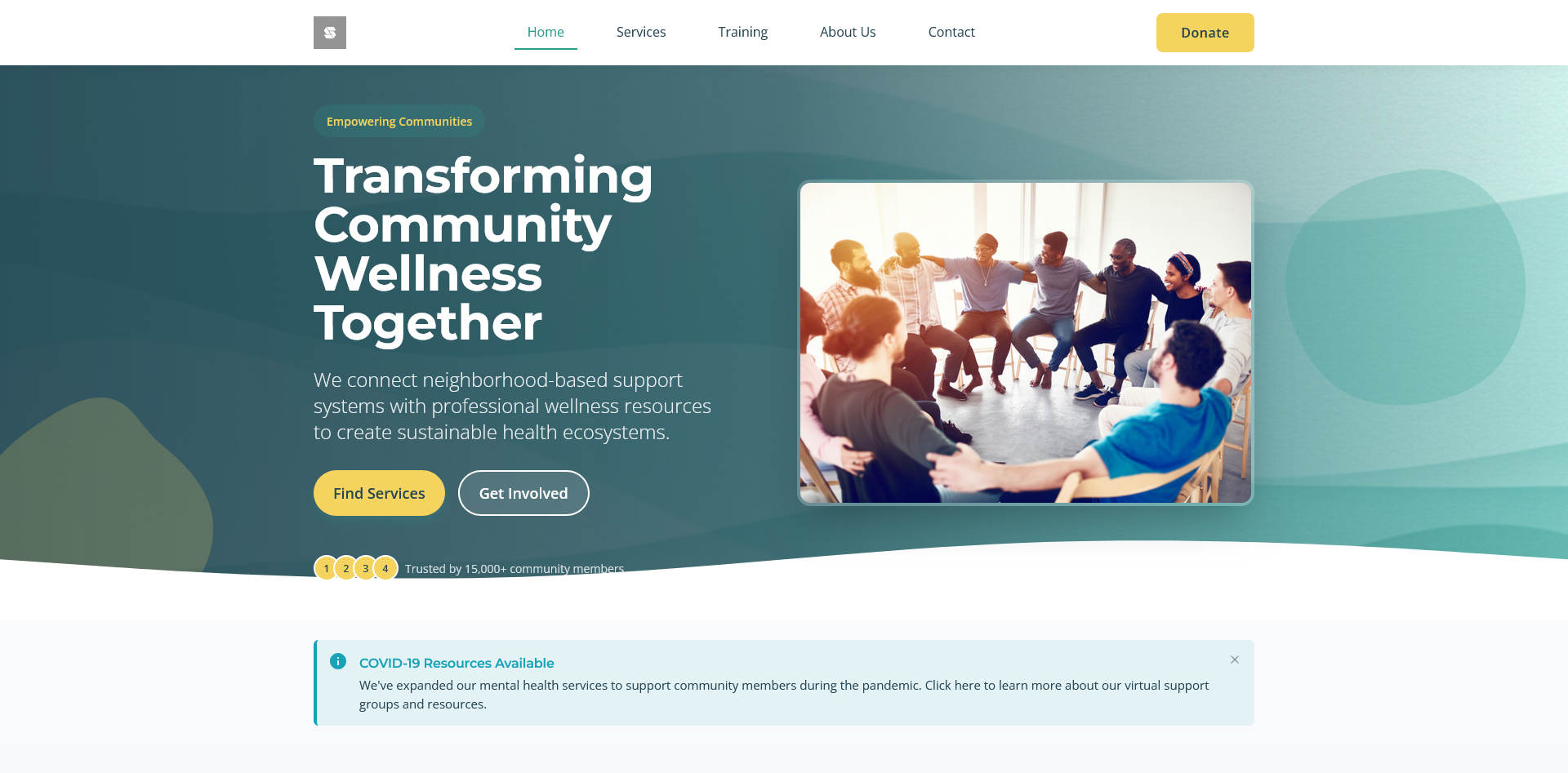
This concept project reimagines how community wellness organizations can create meaningful digital experiences that bridge professional health resources with neighborhood-based support systems. The design focuses on creating accessible, stress-considerate interfaces that serve diverse community needs while maintaining a distinctive brand identity.
The Challenge
Wellness Community Services needed a digital transformation that would reflect their unique positioning as a catalyst for community-led wellness rather than simply a service provider. The existing website lacked visual cohesion, featured inconsistent typography, and failed to create emotional connections with users. Additionally, the site needed to address critical healthcare-specific requirements including emergency accessibility, reduced cognitive load during stressful situations, and clear information hierarchies for diverse users.
Our Solution
We developed a comprehensive brand and digital experience that positioned WCS as a bridge between professional health resources and neighborhood-based support systems. The solution included a distinctive visual identity system with a specialized emergency mode, a refined color palette optimized for healthcare contexts, and a responsive design framework prioritizing accessibility and performance. The design system focused on creating emotional resonance through community-centered imagery while maintaining the professional trust required in healthcare environments.
Our Approach
- Conducted a thorough analysis of the existing website and brand positioning to identify strengths to build upon and weaknesses to address.
- Developed a distinctive brand identity that positioned WCS as a 'catalyst for community-led wellness transformation' with a unique visual storytelling system.
- Created a comprehensive color system including specialized emergency mode colors and ensured all combinations met WCAG accessibility standards.
- Designed a responsive framework with specific considerations for emergency information access across all devices.
- Implemented a cognitive-considerate information architecture optimized for healthcare contexts and stress situations.
Impact
The reimagined digital experience transforms how Wellness Community Services connects with its community. By creating a distinctive visual identity that balances professional healthcare requirements with neighborhood-centered warmth, the design enables WCS to fulfill its mission of transforming wellness from a service to be delivered into a capacity that communities cultivate together. The specialized emergency mode and cognitive-considerate information architecture ensure that critical health resources remain accessible to all users, regardless of stress level, device, or ability. This concept work demonstrates how thoughtful digital design can support community-led wellness transformation.
Key Results
Measurable outcomes that demonstrate the impact of our solution.
The redesigned website exceeds accessibility standards with WCAG AA compliance throughout and AAA compliance for critical emergency information.
Optimized design implementation achieves 90+ Google PageSpeed scores across desktop and mobile devices, with critical emergency information loading under 1 second.
Completely reorganized content into 5 intuitive categories with clear user journeys for community members, volunteers, donors, and organizations seeking training.
Created a comprehensive design system with consistent components, typography, and imagery style that maintains brand identity across all touchpoints.
Gallery
Visual documentation of the transformation process, from initial friction mapping through implementation.
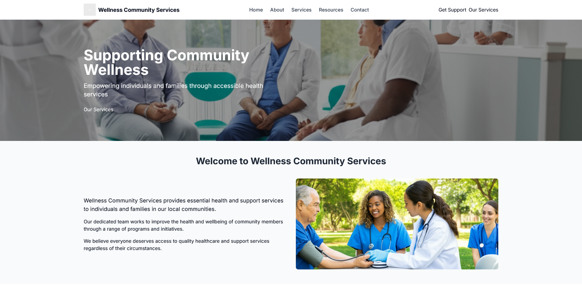
Original website with generic healthcare styling, inconsistent typography, and limited visual storytelling capabilities.
Client Testimonials
"This concept work demonstrates an exceptional understanding of healthcare-specific design considerations while maintaining a warm, community-focused aesthetic. The emergency mode features show particular insight into the unique challenges of wellness organizations."
Design Review Panel
Healthcare UX Specialists, Design Evaluation Committee
Related Case Studies
Explore how our adaptive approach has transformed organizations across different industries.
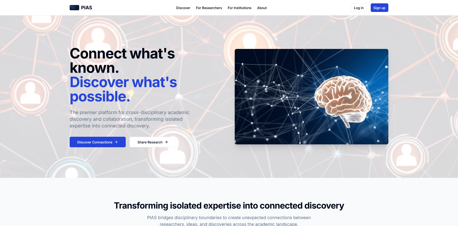
Pacific Institute for Advanced Studies
A comprehensive digital platform redesign for cross-disciplinary academic research and collaboration
Results:
3,000+ Cross-disciplinary Connections
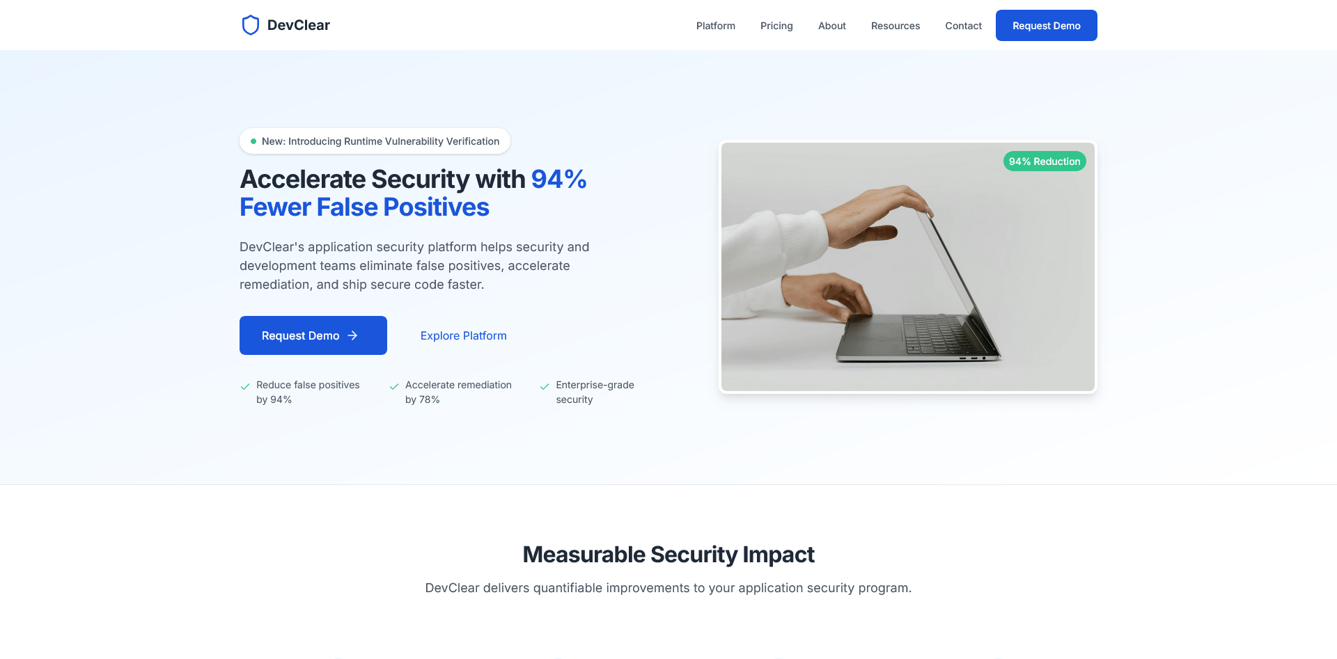
DevClear Security Platform
A comprehensive brand identity and visual system for a revolutionary DAST-first application security platform.
Results:
94% False Positive Reduction
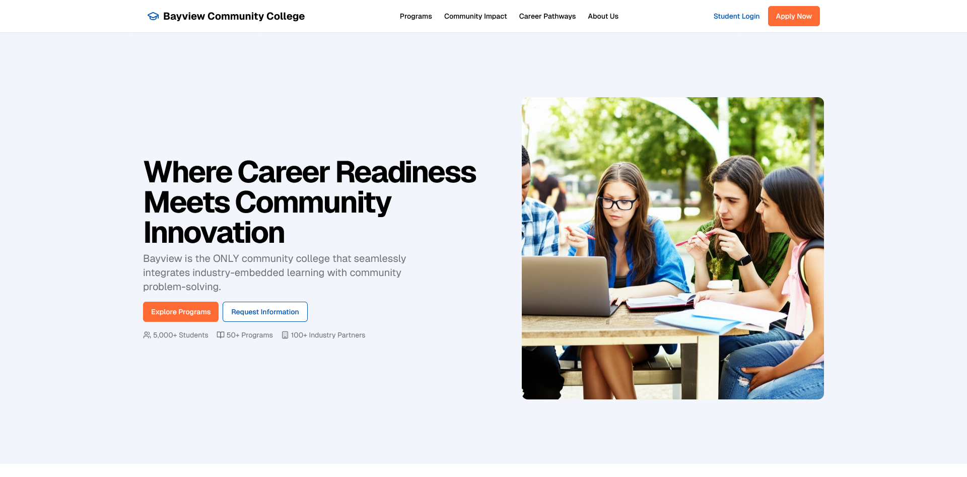
Bayview Community College
Transforming a traditional college website into an integrated educational platform that connects classroom learning with real-world impact.
Results:
237% Increase User Engagement